10. Understanding and Visualizing Convolutional Neural Networks
학습된 ConvNet의 활성화와 필터 시각화, 최근접 이웃과 t-SNE 임베딩으로 표현 이해하기.
원문: Understanding and Visualizing Convolutional Neural Networks — CS231n: Convolutional Neural Networks for Visual Recognition (Stanford University) · © 2015 Andrej Karpathy, MIT License
Visualizing what ConvNets learn
Several approaches for understanding and visualizing Convolutional Networks have been developed in the literature, partly as a response the common criticism that the learned features in a Neural Network are not interpretable. In this section we briefly survey some of these approaches and related work.
신경망이 학습한 특징은 해석할 수 없다는 흔한 비판에 대응하는 뜻도 있어서, ConvNet을 이해하고 시각화하는 여러 접근법이 문헌에서 개발되어 왔다. 이 절에서는 이런 접근법 몇 가지와 관련 연구를 간략히 훑어본다.
Visualizing the activations and first-layer weights
Layer Activations. The most straight-forward visualization technique is to show the activations of the network during the forward pass. For ReLU networks, the activations usually start out looking relatively blobby and dense, but as the training progresses the activations usually become more sparse and localized. One dangerous pitfall that can be easily noticed with this visualization is that some activation maps may be all zero for many different inputs, which can indicate dead filters, and can be a symptom of high learning rates.
층 활성값. 가장 단순한 시각화 기법은 순전파 동안 신경망의 활성값을 그대로 보여주는 것이다. ReLU 신경망이라면 활성값은 대개 학습 초기에는 얼룩덜룩하고 빽빽한 모습으로 시작하지만, 학습이 진행될수록 점점 희소하고 국소적인 모습으로 바뀌어 간다. 이 시각화에서 쉽게 알아챌 수 있는 위험한 함정 하나는, 어떤 활성값 지도가 서로 다른 여러 입력에 대해 모두 0으로만 나오는 경우다. 이는 죽은 필터를 가리킬 수 있고, 학습률이 너무 높다는 징후일 수 있다.
역주. 활성값 지도가 통째로 0이 되는 것은 05번에서 다룬 “죽는 ReLU”와 같은 현상이다. 학습률이 너무 커서 가중치가 크게 갱신되다 보면 ReLU에 들어가는 값이 모든 입력에 대해 음수 쪽으로 밀려날 수 있고, 그러면 그 뉴런은 이후로 다시는 활성화되지 않는다. 이 절에서 말하는 “죽은” 필터는 그런 뉴런들이 만들어내는 활성값 지도를 가리킨다.
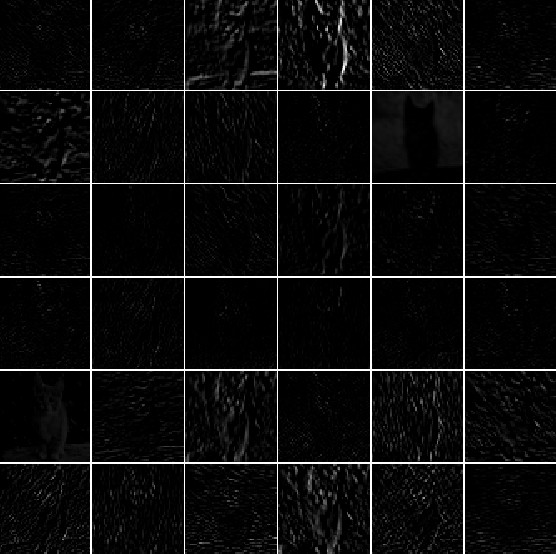
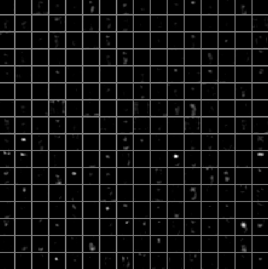 Typical-looking activations on the first CONV layer (left), and the 5th CONV layer (right) of a trained AlexNet looking at a picture of a cat. Every box shows an activation map corresponding to some filter. Notice that the activations are sparse (most values are zero, in this visualization shown in black) and mostly local.
고양이 사진을 보고 있는 학습된 AlexNet의 첫 번째 CONV 층(왼쪽)과 다섯 번째 CONV 층(오른쪽)에서 나타나는 전형적인 활성값. 상자 하나하나가 어떤 필터에 대응하는 활성값 지도를 보여준다. 활성값이 희소하고(대부분의 값이 0이며, 이 시각화에서는 검은색으로 표시된다) 대체로 국소적이라는 점에 주목하자.
Conv/FC Filters. The second common strategy is to visualize the weights. These are usually most interpretable on the first CONV layer which is looking directly at the raw pixel data, but it is possible to also show the filter weights deeper in the network. The weights are useful to visualize because well-trained networks usually display nice and smooth filters without any noisy patterns. Noisy patterns can be an indicator of a network that hasn’t been trained for long enough, or possibly a very low regularization strength that may have led to overfitting.
Conv/FC 필터. 두 번째로 흔한 전략은 가중치를 시각화하는 것이다. 날것 그대로의 픽셀 데이터를 직접 들여다보는 첫 CONV 층에서 이 방법이 대개 가장 잘 해석되지만, 신경망 더 깊은 곳의 필터 가중치도 얼마든지 보여줄 수 있다. 가중치를 시각화하는 것이 쓸모 있는 이유는, 잘 학습된 신경망은 대개 잡음 섞인 패턴 없이 매끈하고 깔끔한 필터를 보여주기 때문이다. 잡음 섞인 패턴은 신경망이 충분히 오래 학습되지 않았다는 신호이거나, 정규화 세기가 너무 낮아 과적합으로 이어졌다는 신호일 수 있다.
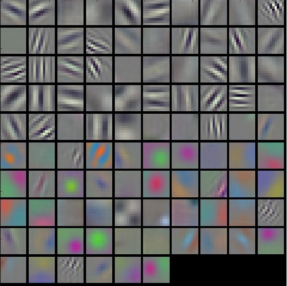
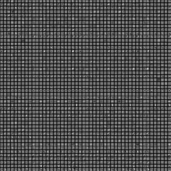 Typical-looking filters on the first CONV layer (left), and the 2nd CONV layer (right) of a trained AlexNet. Notice that the first-layer weights are very nice and smooth, indicating nicely converged network. The color/grayscale features are clustered because the AlexNet contains two separate streams of processing, and an apparent consequence of this architecture is that one stream develops high-frequency grayscale features and the other low-frequency color features. The 2nd CONV layer weights are not as interpretable, but it is apparent that they are still smooth, well-formed, and absent of noisy patterns.
학습된 AlexNet의 첫 번째 CONV 층(왼쪽)과 두 번째 CONV 층(오른쪽)에서 나타나는 전형적인 필터. 첫 번째 층의 가중치는 매우 깔끔하고 매끈하며, 이는 신경망이 잘 수렴했음을 보여준다. 색상/흑백 특징이 무리 지어 나타나는 이유는 AlexNet이 두 개의 별도 처리 흐름으로 이루어져 있기 때문이며, 이 구조가 낳는 눈에 띄는 결과 하나는 한쪽 흐름은 고주파의 흑백 특징을, 다른 쪽 흐름은 저주파의 색상 특징을 발달시킨다는 것이다. 두 번째 CONV 층의 가중치는 그만큼 해석하기 쉽지는 않지만, 여전히 매끈하고 잘 형성되어 있으며 잡음 섞인 패턴이 없다는 것은 확인할 수 있다.
Retrieving images that maximally activate a neuron
Another visualization technique is to take a large dataset of images, feed them through the network and keep track of which images maximally activate some neuron. We can then visualize the images to get an understanding of what the neuron is looking for in its receptive field. One such visualization (among others) is shown in Rich feature hierarchies for accurate object detection and semantic segmentation by Ross Girshick et al.:
또 다른 시각화 기법은 큰 이미지 데이터셋을 신경망에 통과시키면서 어떤 뉴런을 가장 크게 활성화하는 이미지가 무엇인지 기록해 두는 것이다. 그런 다음 그 이미지들을 시각화하면 해당 뉴런이 자기 수용 영역에서 무엇을 찾고 있는지 감을 잡을 수 있다. 이런 시각화의 한 예(다른 예도 여럿 있다)를 Ross Girshick 등이 쓴 논문 Rich feature hierarchies for accurate object detection and semantic segmentation에서 볼 수 있다.
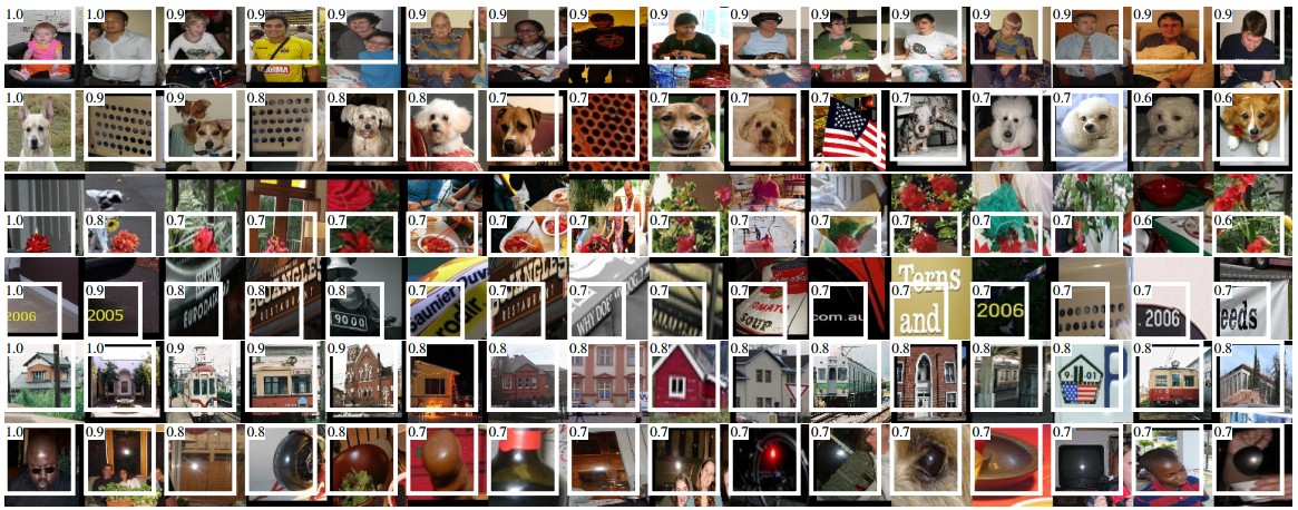 Maximally activating images for some POOL5 (5th pool layer) neurons of an AlexNet. The activation values and the receptive field of the particular neuron are shown in white. (In particular, note that the POOL5 neurons are a function of a relatively large portion of the input image!) It can be seen that some neurons are responsive to upper bodies, text, or specular highlights.
AlexNet의 몇몇 POOL5(다섯 번째 pooling 층) 뉴런을 가장 크게 활성화하는 이미지들. 해당 뉴런의 활성값과 수용 영역이 흰색으로 표시되어 있다. (특히 POOL5 뉴런은 입력 이미지의 꽤 넓은 부분에 대한 함수라는 점에 주목하자!) 어떤 뉴런은 상반신에, 어떤 뉴런은 글자에, 또 어떤 뉴런은 반사광(specular highlight)에 반응한다는 것을 볼 수 있다.
One problem with this approach is that ReLU neurons do not necessarily have any semantic meaning by themselves. Rather, it is more appropriate to think of multiple ReLU neurons as the basis vectors of some space that represents in image patches. In other words, the visualization is showing the patches at the edge of the cloud of representations, along the (arbitrary) axes that correspond to the filter weights. This can also be seen by the fact that neurons in a ConvNet operate linearly over the input space, so any arbitrary rotation of that space is a no-op. This point was further argued in Intriguing properties of neural networks by Szegedy et al., where they perform a similar visualization along arbitrary directions in the representation space.
이 접근법의 한 가지 문제는 ReLU 뉴런 하나하나가 반드시 그 자체로 의미 있는 무언가를 나타내지는 않는다는 것이다. 오히려 여러 개의 ReLU 뉴런을 이미지 패치를 표현하는 어떤 공간의 기저 벡터(basis vector)로 생각하는 편이 더 적절하다. 다시 말해 이 시각화는 필터 가중치에 대응하는 (임의로 고른) 축을 따라, 표현들이 이루는 구름의 가장자리에 있는 패치들을 보여주고 있을 뿐이다. 이는 ConvNet의 뉴런이 입력 공간에 대해 선형적으로 작동하므로 그 공간을 어떻게 임의로 회전시키더라도 결과에는 아무 일도 일어나지 않는다는 사실로도 알 수 있다. 이 점은 Szegedy 등이 쓴 논문 Intriguing properties of neural networks에서 더 깊이 다루었는데, 이들은 표현 공간의 임의의 방향을 따라 비슷한 시각화를 수행했다.
Embedding the codes with t-SNE
ConvNets can be interpreted as gradually transforming the images into a representation in which the classes are separable by a linear classifier. We can get a rough idea about the topology of this space by embedding images into two dimensions so that their low-dimensional representation has approximately equal distances than their high-dimensional representation. There are many embedding methods that have been developed with the intuition of embedding high-dimensional vectors in a low-dimensional space while preserving the pairwise distances of the points. Among these, t-SNE is one of the best-known methods that consistently produces visually-pleasing results.
ConvNet은 이미지를 점점 선형 분류기로 클래스를 나눌 수 있는 표현으로 서서히 변환해 가는 과정으로 볼 수 있다. 이미지를 2차원으로 임베딩(embedding)해서 저차원 표현에서의 거리가 고차원 표현에서의 거리와 대략 같아지도록 만들면, 이 공간이 대략 어떤 모양으로 생겼는지 감을 잡을 수 있다. 점들 사이의 쌍별 거리를 보존하면서 고차원 벡터를 저차원 공간에 임베딩한다는 발상으로 개발된 임베딩 기법은 여럿 있다. 그중에서도 t-SNE는 언제나 보기 좋은 결과를 내놓는 것으로 가장 잘 알려진 방법 가운데 하나다.
To produce an embedding, we can take a set of images and use the ConvNet to extract the CNN codes (e.g. in AlexNet the 4096-dimensional vector right before the classifier, and crucially, including the ReLU non-linearity). We can then plug these into t-SNE and get 2-dimensional vector for each image. The corresponding images can them be visualized in a grid:
임베딩을 만들려면 이미지 집합을 준비하고 ConvNet으로 CNN 코드(CNN codes)를 뽑아내면 된다(예컨대 AlexNet이라면 분류기 바로 앞의 4096차원 벡터이고, 결정적으로 ReLU 비선형성까지 거친 값이다). 이렇게 얻은 CNN 코드를 t-SNE에 넣으면 이미지마다 2차원 벡터를 얻을 수 있다. 그러면 대응하는 이미지들을 격자 형태로 시각화할 수 있다.
역주. 이 그림은 01번 포스트에서 본 t-SNE 임베딩과 나란히 놓고 보면 좋다. 그때는 픽셀 값만으로 거리를 재서 배경이 비슷한 이미지들이 뭉쳤지만, 여기서는 ConvNet이 뽑아낸 CNN 코드로 거리를 재기 때문에 배경이 아니라 클래스와 의미가 비슷한 이미지들이 뭉친다. 같은 t-SNE 기법이라도 어떤 표현을 임베딩하느냐에 따라 “가깝다”의 뜻이 완전히 달라지는 것이다.
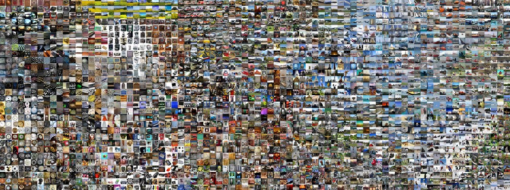 t-SNE embedding of a set of images based on their CNN codes. Images that are nearby each other are also close in the CNN representation space, which implies that the CNN “sees” them as being very similar. Notice that the similarities are more often class-based and semantic rather than pixel and color-based. For more details on how this visualization was produced the associated code, and more related visualizations at different scales refer to t-SNE visualization of CNN codes.
이미지 집합의 CNN 코드를 바탕으로 만든 t-SNE 임베딩. 서로 가까이 있는 이미지는 CNN 표현 공간에서도 가까이 있다는 뜻이며, 이는 CNN이 그 이미지들을 서로 매우 비슷하다고 “보고” 있음을 의미한다. 이때의 비슷함은 픽셀이나 색상 기준보다는 클래스와 의미 기준일 때가 더 많다는 점에 주목하자. 이 시각화를 만든 방법과 관련 코드, 그리고 여러 스케일에서 본 관련 시각화를 더 보고 싶다면 t-SNE visualization of CNN codes를 참고하라.
Occluding parts of the image
Suppose that a ConvNet classifies an image as a dog. How can we be certain that it’s actually picking up on the dog in the image as opposed to some contextual cues from the background or some other miscellaneous object? One way of investigating which part of the image some classification prediction is coming from is by plotting the probability of the class of interest (e.g. dog class) as a function of the position of an occluder object. That is, we iterate over regions of the image, set a patch of the image to be all zero, and look at the probability of the class. We can visualize the probability as a 2-dimensional heat map. This approach has been used in Matthew Zeiler’s Visualizing and Understanding Convolutional Networks:
ConvNet이 어떤 이미지를 개로 분류했다고 하자. 이 판단이 실제로 이미지 속 개를 보고 내린 것인지, 아니면 배경의 맥락 단서나 다른 잡다한 물체를 보고 내린 것인지 어떻게 확신할 수 있을까? 분류 예측이 이미지의 어느 부분에서 비롯됐는지 조사하는 한 가지 방법은, 관심 클래스(예컨대 개 클래스)의 확률을 가리개(occluder) 물체의 위치에 대한 함수로 그려 보는 것이다. 곧 이미지의 여러 영역을 차례로 돌면서 이미지의 한 조각을 모두 0으로 바꾸고 그때의 클래스 확률을 살펴본다. 이 확률을 2차원 히트맵으로 시각화할 수 있다. 이 접근법은 Matthew Zeiler의 논문 Visualizing and Understanding Convolutional Networks에서 쓰였다.
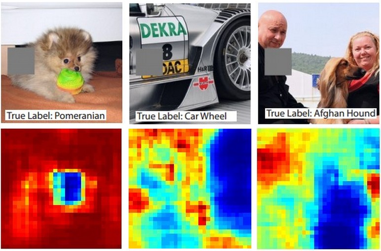 Three input images (top). Notice that the occluder region is shown in grey. As we slide the occluder over the image we record the probability of the correct class and then visualize it as a heatmap (shown below each image). For instance, in the left-most image we see that the probability of Pomeranian plummets when the occluder covers the face of the dog, giving us some level of confidence that the dog’s face is primarily responsible for the high classification score. Conversely, zeroing out other parts of the image is seen to have relatively negligible impact.
세 장의 입력 이미지(위쪽). 가리개 영역은 회색으로 표시되어 있다는 점에 주목하자. 가리개를 이미지 위로 옮겨가며 정답 클래스의 확률을 기록한 뒤 그것을 히트맵으로 시각화한다(각 이미지 아래에 표시). 예컨대 맨 왼쪽 이미지를 보면 가리개가 개의 얼굴을 덮었을 때 포메라니안일 확률이 급격히 떨어지는데, 이는 개의 얼굴이 높은 분류 점수를 내는 데 주된 역할을 한다는 어느 정도의 확신을 준다. 반대로 이미지의 다른 부분을 0으로 바꾸는 것은 상대적으로 영향이 거의 없는 것으로 보인다.
Visualizing the data gradient and friends
Data Gradient(데이터 기울기). Deep Inside Convolutional Networks: Visualising Image Classification Models and Saliency Maps
DeconvNet. Visualizing and Understanding Convolutional Networks
Guided Backpropagation. Striving for Simplicity: The All Convolutional Net
Reconstructing original images based on CNN Codes
Understanding Deep Image Representations by Inverting Them
How much spatial information is preserved?
Do ConvNets Learn Correspondence? (tldr: yes — 그렇다)
Plotting performance as a function of image attributes
ImageNet Large Scale Visual Recognition Challenge
Fooling ConvNets
Explaining and Harnessing Adversarial Examples